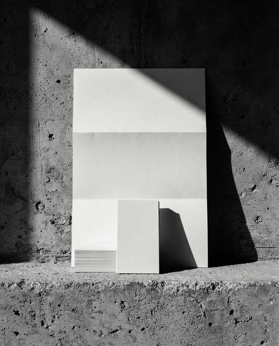
01 · Starting point — three typefaces, two blues and a logo nobody had in vector.
Architecture studio · 2025
“We grew and the brand we made at the start can’t keep up.”
A recognized firm without a brand to match.
Nordvik had spent eleven years building award-winning work, but presented itself with an inherited logo and a website that showed nothing. They were losing bids to younger studios with a better visual story.
Make the brand behave like their architecture.
We built a system on the same logic as their work: a strict grid, honest materials and no ornament at all. The identity doesn’t decorate the projects; it frames them.
↓ 09 plates — from what was broken to what shipped
01 · Starting point — three typefaces, two blues and a logo nobody had in vector.
02 · Decision — the angle isn’t aesthetic: it is the only one that survives an 8 mm embroidery.
03 · Decision — we went from three weights to one. The system had to survive people who aren’t designers.
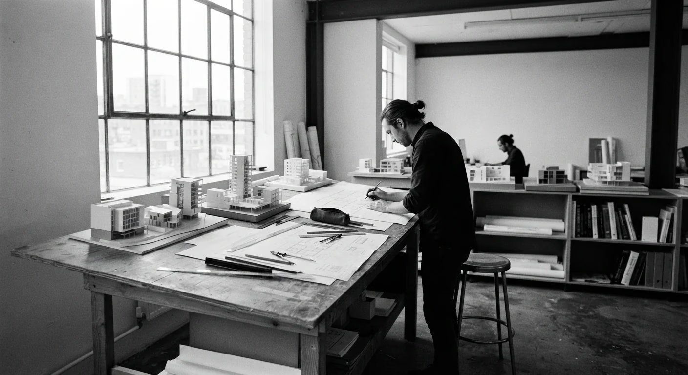
04 · Proof — we printed before approving. On screen the gray worked; in offset it closed up.
“The guidelines run 24 pages. Half of them are examples of what not to do.”
05 · Hinge — the only time the studio speaks inside the axis of the work.
Discarded route · v03
06 · Discarded — this route reached mockup and we killed it: the chevron stopped reading at 16 px.
variables.css · same file as the guidelines
:root {
  --ink:        #000000;
  --bone:       #E6E6E6;
  --chev-span:  192px;   /* 8 × calle */
  --chev-rise:   96px;   /* 4 × calle */
  --e-cut:      cubic-bezier(.76,0,.24,1);
  --t-3:        360ms;
}
07 · Delivery — the design variables in the guidelines and the ones in the code are the same file.
Live · real component
This is the button that is in production
[ See variables ]
08 · Proof — this button is the one in production. Press it.
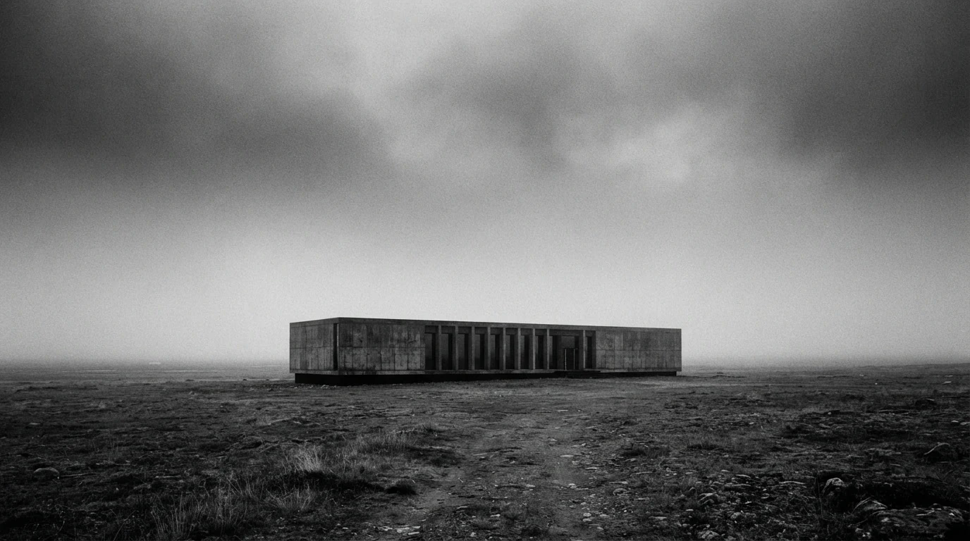
09 · Result — week 11. The brand and the site went live the same day.
The result
12 months, measured by the client in their CRM.
Compared with the previous twelve months.
LCP on simulated 4G, static site.
«For the first time the brand looks like what we build. We stopped explaining who we are at every meeting.»
We reply within 48 business hours.